
6 Signs Your Website Design Is Hurting Your Conversion Rate Optimization (And How to Fix Them)
- alexandralevchuk
- May 11, 2025
- 2 min read

After redesigning dozens of websites over the past decade, I noticed something important: the designs that convert don’t just look great—they feel effortless.
They guide the user. They reduce friction. And they make taking action feel easy.
When your product or website just works, users don’t even notice the design. They just move.
But when they pause? Get confused? Click around wondering what to do next?
That friction is silently killing conversions, trust, and user momentum.
Here are 6 signs you might be shipping a confusing experience—and how to fix it for better conversion rate optimization: If you’re more of a visual learner, this will walk you through the same concepts with quick hits and clean UI examples:


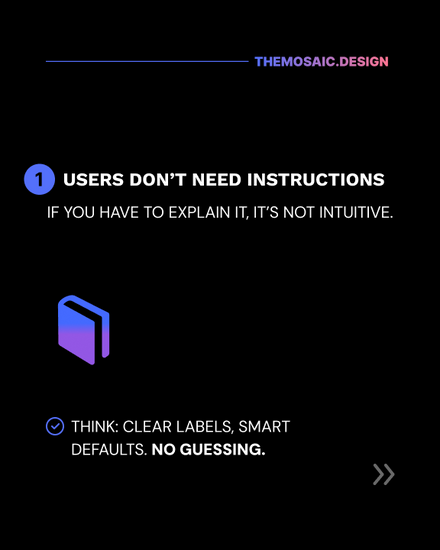


1. Users don’t need instructions
If you have to explain how something works, it’s not intuitive. Great UX feels obvious. Test your site with fresh eyes: can someone complete a key action without you telling them how?
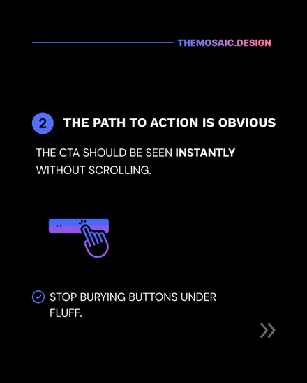
2. The path to action is obvious
Your CTA shouldn't be a treasure hunt. It should be the most natural next step on the page. If your users are hunting for a button or unsure where to go next, you're losing them.
3. Every element has a job
If something is "just there to look nice," reconsider it. On a high-converting site, every word, image, and icon earns its spot. Purpose-driven design outperforms pretty fluff every time.
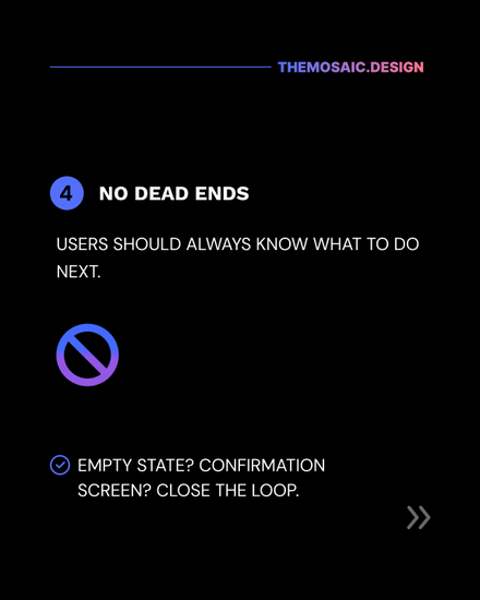
4. There’s zero dead ends Every interaction should lead somewhere. Whether it’s a next step, a thank-you message, or an email confirmation, never leave users wondering if they finished the task.
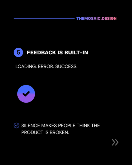
5. Feedback is built-in
Is something loading? Did a form submission fail? Did it succeed? Tell your users. Silence creates doubt. Micro-interactions and feedback loops are how you build confidence.
6. You’ve removed 90% of the “maybes”
Clarity > cleverness. If you're unsure whether something is helpful, clear, or necessary—cut it. Clean interfaces outperform clever distractions. Want to explore how strategic thinking sharpens your UX instincts?
Check out this post on assumption-based design to see how faster decisions (done right) can still lead to powerful results.
Optimizing for Flow = Optimizing for Conversion Rate Optimization
When your design is truly good, people don’t talk about the design.
They talk about how easy it was to sign up. How smooth the experience felt. And how quickly they got what they came for.
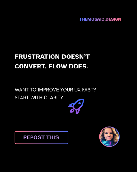
Because frustration doesn’t convert.
Flow does.
Want a frictionless review of your site? I offer website UX audits and conversion rate optimization strategy through theMosaic.design — built to help startups improve clarity, reduce bounce, and convert better.
Let’s make your site feel effortless. P.S. Curious how small UX tweaks can be tested for real results?
Don’t miss this guide to running A/B tests on your product pages—perfect if you’re ready to move from guesswork to data-backed design.


Comments